 Swift Ideas
Product design & design systems
Design systems written down, then built.
We design products as systems, not collections of screens. Colours, spacing and type are shared between web and mobile, every component is documented in one catalogue, and a written design guide states the rules in words a developer can follow. Every template is scored in our own design review, fixed, then scored again.
What clients arrive with
- Our web app and mobile app look like two different companies.
- Every screen is a one-off, and developers guess the spacing.
- We need a designer who can also ship the component.
- Accessibility was an afterthought and is now a backlog.
- Our product looks like every other AI startup template.
What you get
- A direction, written down
- A DESIGN.md covering the idea, palette, type, spacing, motion and the things the product must never look like, agreed before components are built.
- Tokens shared across platforms
- Colour, radius, spacing and type in one package that both the web app and the mobile app import. On Benjamin Bailey Electrics, raw hex values moved into theme tokens, which made the component set reusable.
- A coded component library
- React components with their states documented in Storybook: empty, loading, error, long content and narrow screens, not only the happy path.
- Scored design critique
- Each key template is scored out of 40 in our own structured design review, fixed and re-scored, so quality is tracked rather than argued about.
- Accessibility built into the system
- WCAG 2.1 AA contrast checked on every surface, visible focus, full keyboard operation, reduced-motion alternatives, and colour never the only carrier of meaning.
- Regulated and dense interfaces
- Design for clinical, GxP and data-heavy workflows, where the right answer is often more information on screen, laid out so it can be scanned quickly and trusted.
How the work runs
Audit
We capture every screen in the current product at phone and desktop widths and list the inconsistencies, accessibility failures and one-off patterns.
Set the direction
One direction, prototyped in the browser with real content, because density, motion and responsive behaviour are hard to judge from static frames.
Build the system
Tokens first, then components with all their states, then templates assembled only from those components.
Critique and adopt
Scored critique of each template, fixes, re-scores, then migration of existing screens onto the system in order of traffic.
How engagements start
- Design audit and direction as a fixed-scope first phase.
- System build alongside your engineers, or as part of a build we run end to end.
- Retained design review for teams who want every new template critiqued before it ships.
Built with
Where each number comes from
Each figure names where it comes from.
- Benjamin Bailey Electrics homepage score in our design review, across three passes
- 25 → 38/40
- Source: Our own score, from our design review reports, May to June 2026
- service template score out of 40 in our design review
- 29 → 40
- Source: Benjamin Bailey Electrics: our design review reports, 31 May to 1 June 2026
- muted text contrast, fixed site-wide
- 3.11:1 → AA
- Source: Benjamin Bailey Electrics: measured in our first design review, fix confirmed in the project's commit history
The work behind it
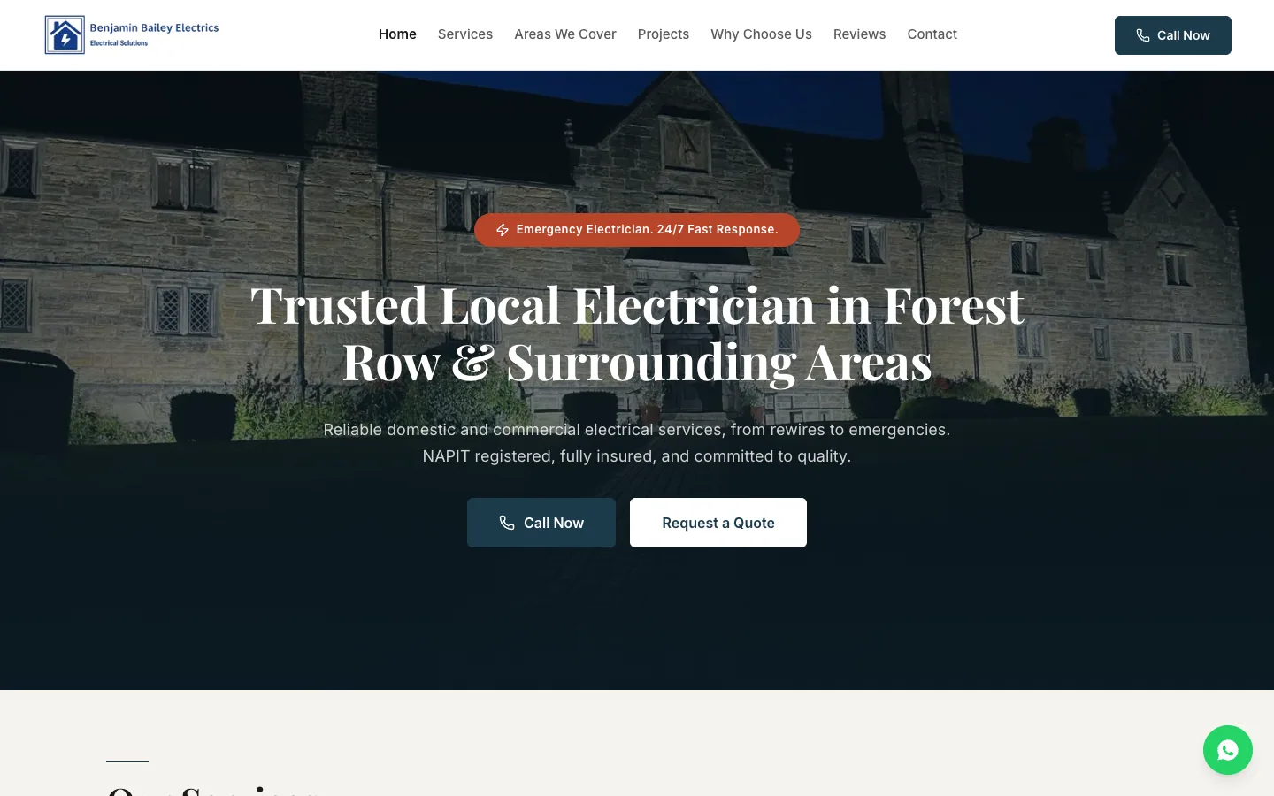 Benjamin Bailey ElectricsA one-person electrician's site, scored from 25 to 38 out of 40 in our design review.
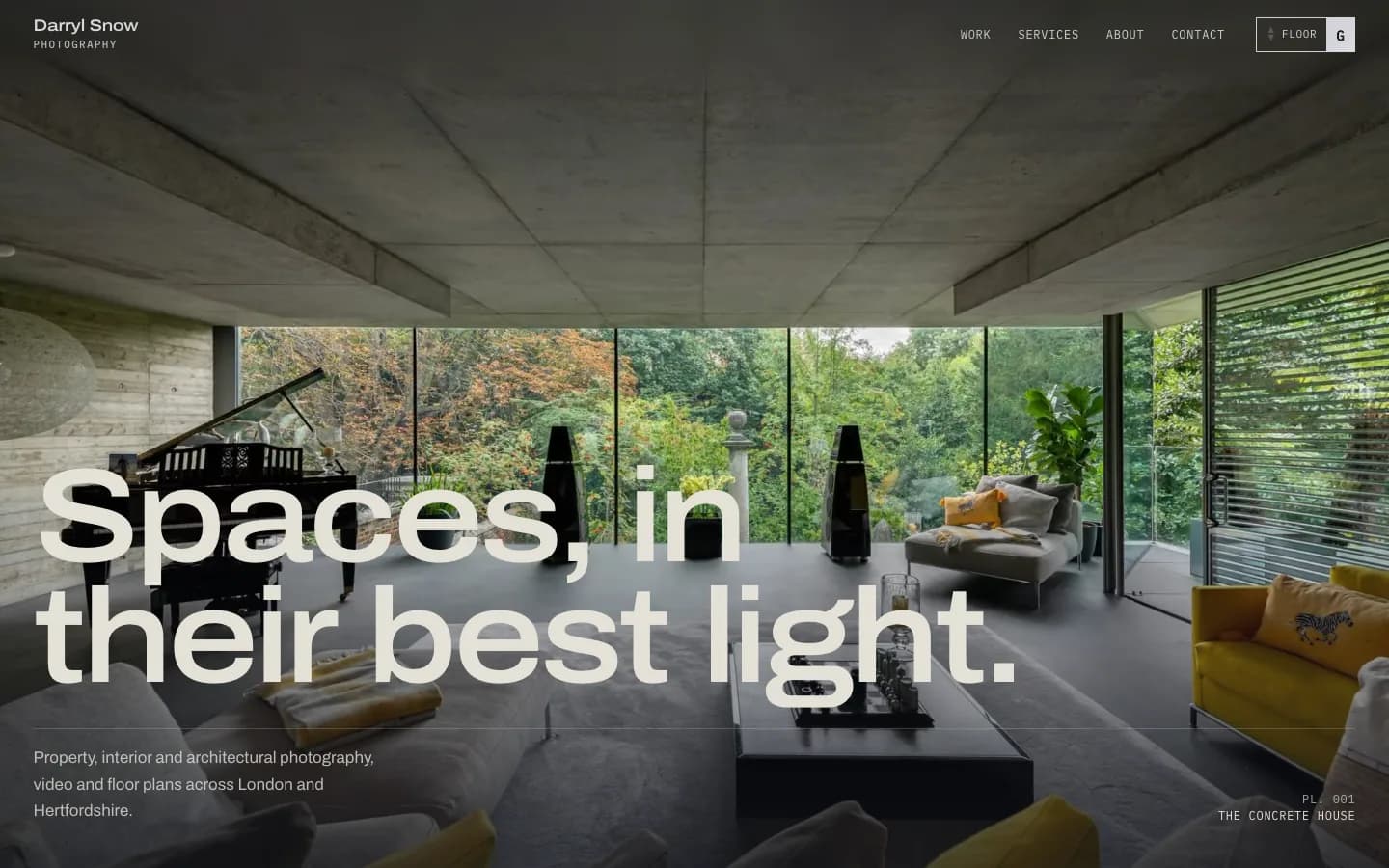 Darryl Snow PhotographyA portfolio that waits for blue hour, then switches the lamps on.
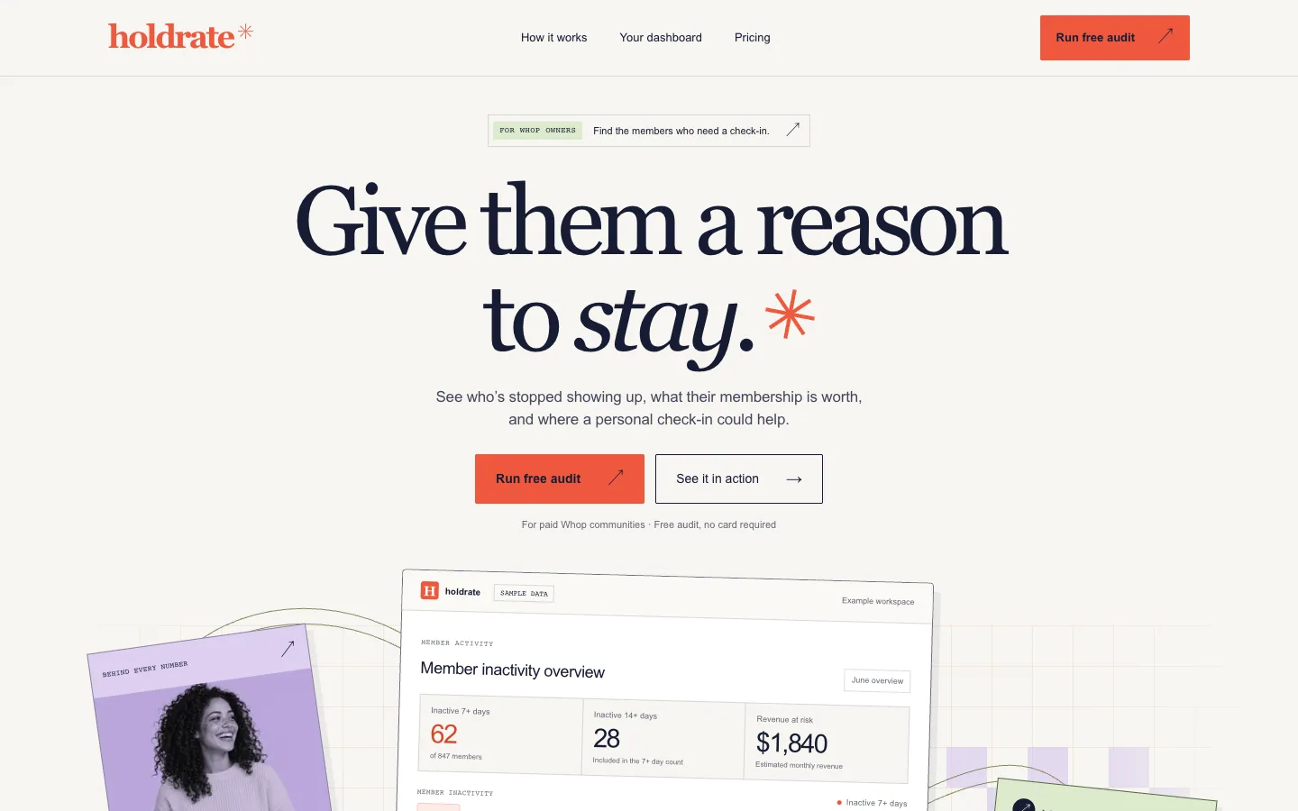 HoldrateSee which paying members went quiet, and what that costs.
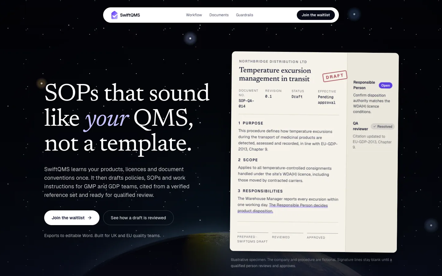 SwiftQMSSOPs drafted in your QMS's own voice, then handed to a person.
Questions, answered
Something else on your mind? hello@swiftideas.com
Do you design in Figma or in code?
Mostly in code. We prototype in the browser from the start because motion, density and responsive behaviour are hard to judge in static frames, and what we prototype becomes the component your team ships.
Can you work with our existing brand?
Yes. We translate your brand into tokens and rules for a product interface, and tell you where the brand needs extending for states a marketing site never has, such as errors, empty tables and dense data.
Will the system work on mobile as well as the web?
Yes. Tokens live in one typed package that both the React and React Native apps read from, and the package can generate the matching CSS variables, so the two platforms start from the same values.
How do you measure design quality?
With our own structured design review, scored out of 40 per template, plus accessibility checks on contrast, focus and keyboard operation. Scores are recorded before and after fixes, and we label them as our own assessment.
Do you run user research?
We run focused usability reviews and critique sessions with your users and team. For large research programmes, we work alongside a dedicated research partner.